Trailer
Role
Level Designer
Key Responsibilities
Designed, greyboxed, detailed and lit all 7 levels in the AotE
Scripted basic level logic
Designed and prototyped unit abilities

Overview
Attack Of The Earthlings is a comedic turn based strategy that pits Galactoil; an all consuming evil corporation against the Alien hornets nest they just kicked; “The Swarmers”. As the player you control these alien forces who have infiltrated the giant Galactoil Drill; a gigantic structure that is currently burrowing and mining into your home. Your mission? Leave no survivors (and by that I mean kill anything with a human heartbeat be it armed guard, innocent scientist or naked maintenance worker – did i mention this wasn’t a serious game?)
My core role on the team during this project was mission and level designer. I joined the team shortly after pre-production had been completed and was tasked with designing and creating a series of levels that complemented the narrative tone and core gameplay mechanics.
A brief outline of the story was provided by the creative director, but ultimately I was given a lot of freedom in directing where the narrative went. We initially planned for a larger number of levels and a more flexible narrative that included branching paths with certain missions directly affecting later ones. Whilst theses levels were designed and greyboxed, almost all branching missions were ultimately cut due to time constraints and the designs were either shelved or re-purposed into main missions.
The final result was 8 levels (7 plus an exterior tutorial) each lasting roughly 40 minutes – an hour in play time. Each level attempted to address a different micro style, whilst still maintaining the macro themes and designs of the game. e.g. one level put a heavier emphasis on stealth, another on defensive combat etc. Because of this, each level had their design heavily influenced by the micro themes.
Levels
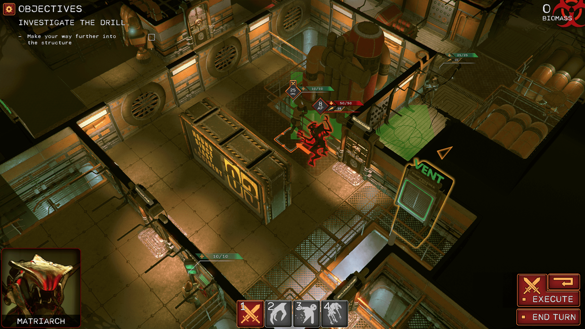
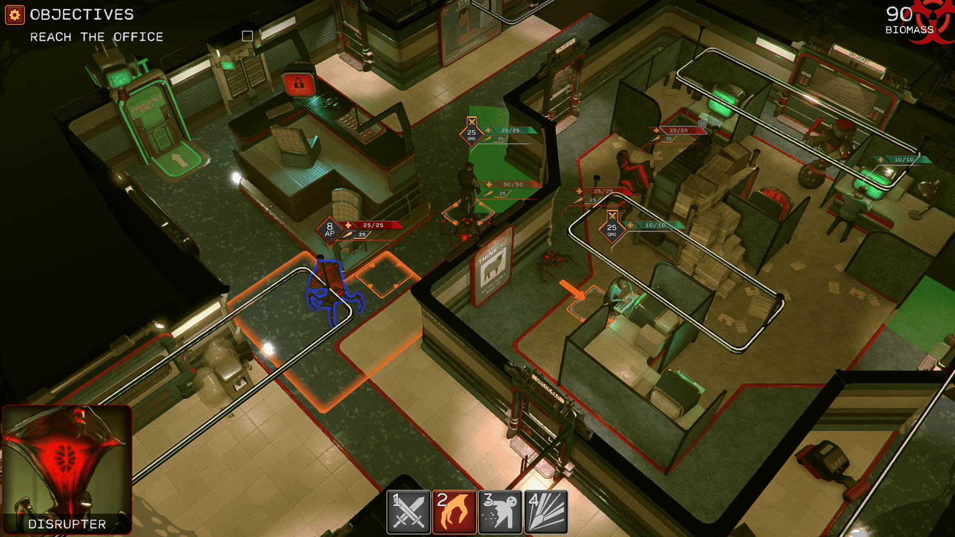
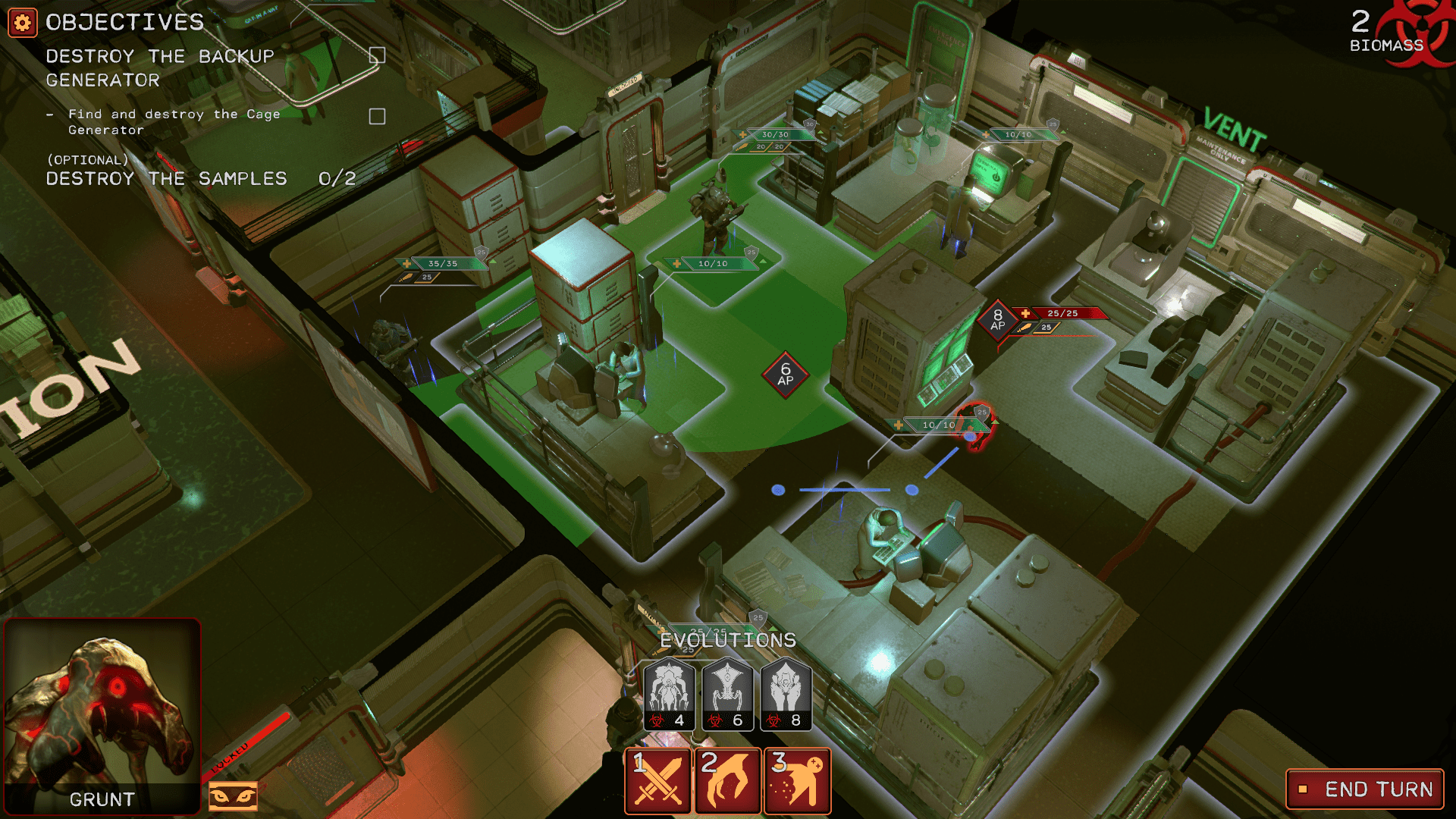
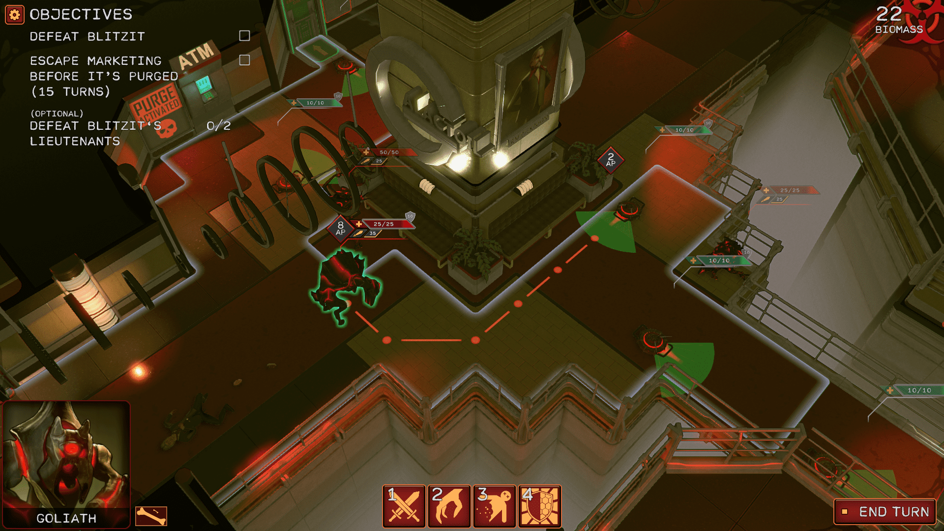
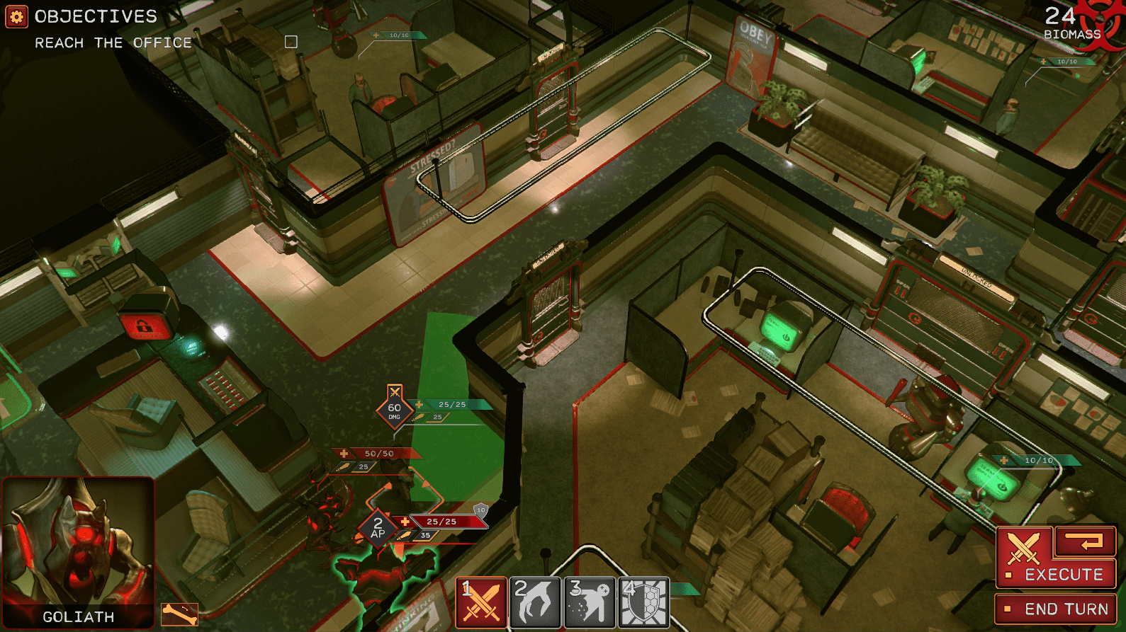
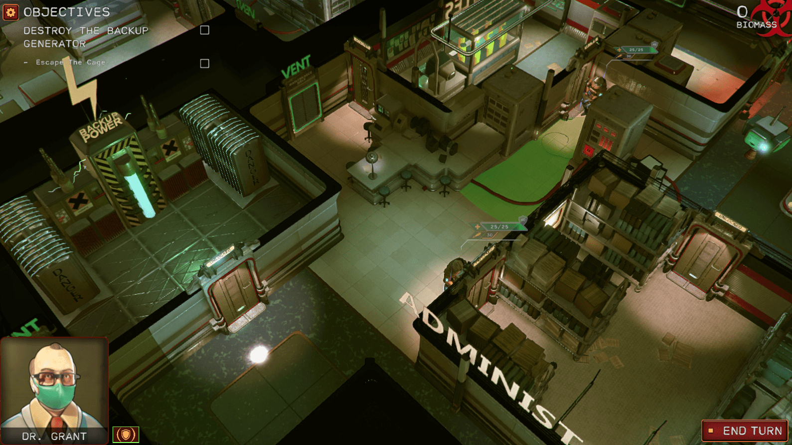
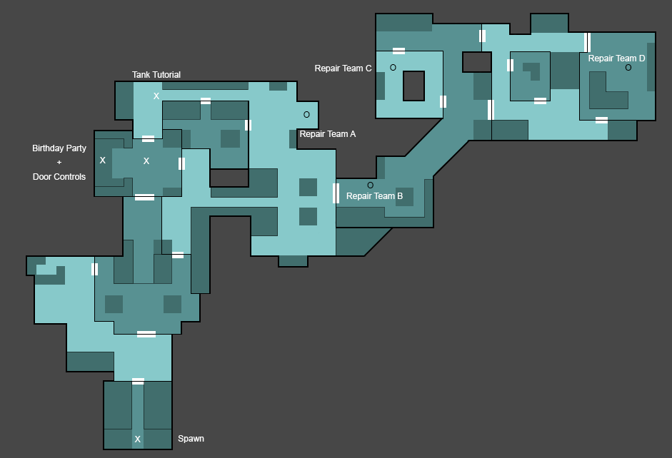
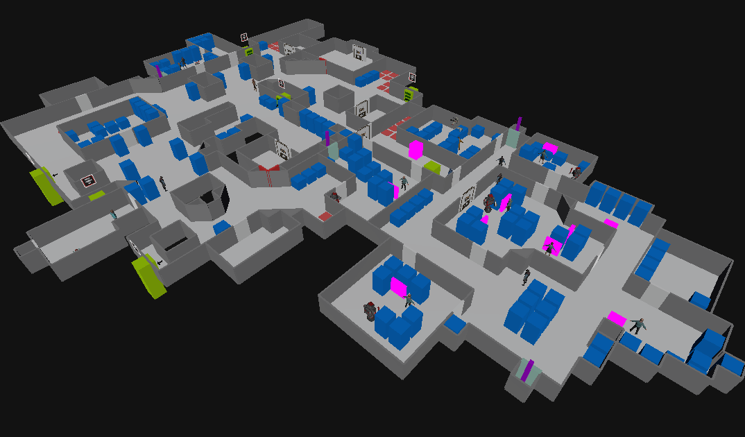
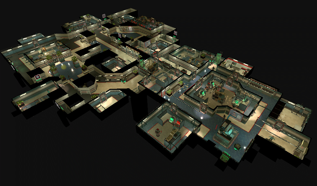
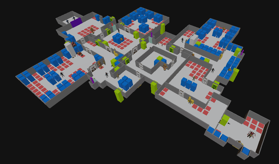
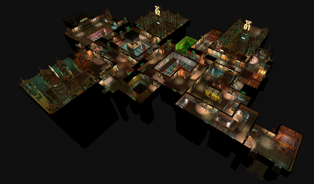
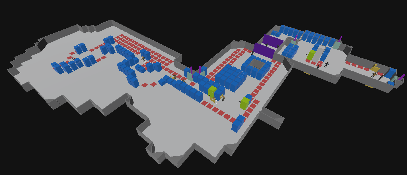
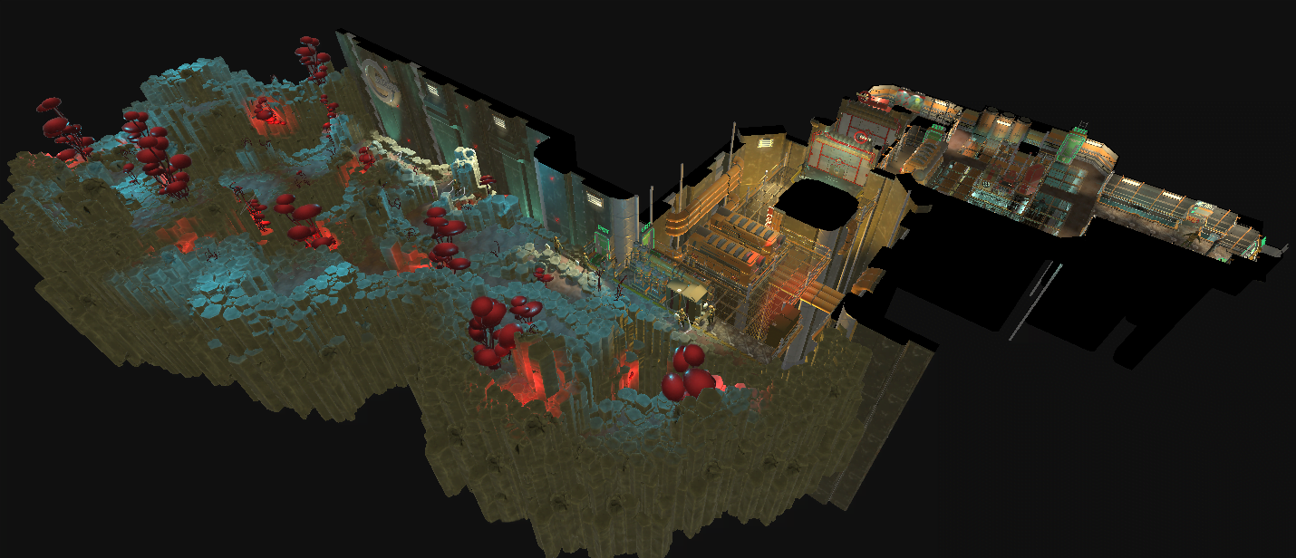
13 levels were initially designed and greyboxed. The final number of levels was then cut down to 8 due to time constraints, and these 8 levels were detailed, polished and are present in the final game. Below are some of these levels.
[twentytwenty]
 [/twentytwenty]
[twentytwenty]
[/twentytwenty]
[twentytwenty]
 [/twentytwenty]
Design Considerations
If i was to discuss every aspect of every level, this project would never end, so here are some of the basic design considerations made when designing the levels for Attack of the Earthlings.
Initial layout of the levels were designed and sketched out on a macro level first. Initially I wasn’t worried too much by the micro designs of the rooms, so much as the overal scale and flow of the levels themselves. Too short and player’s would be left unsatisfied with the result, too long and they would become fatigued and exhausted. The intended design length was 30-35 turns (roughly equating to 40 minutes of gameplay) that many players would later express to be the “sweet spot” for a missions length. This metric was unfortunately not available during the initial design stage and would only later come about after hours of playtesting and feedback, so a lot of the missions were “eyeballed” upon conception. Most hit the mark and were later refined to meet the metric’s sweet spot, but some ultimately overshot (mostly due to the nature that new players would take extra turns insuring saftey over opportunity – which I touch on later).
Greybox of the levels was done shortly after using in house tools. This is where I began to really focus on the small designs of each “combat area”. I broke the map down into small chunks that represented 1-2 turns worth of gameplay with an intended set of goals or challenges I wanted the player to overcome in that area. Essentially each combat zone was a small puzzle that the players had to plan around. There were numerous solutions (often surprising ones I hadn’t anticipated that came up in playtests) but there was an “intended” set of actions i predicted the player to make so designed cover, enemies, hiding spots and patrol routes around those. By breaking the combat areas down into smaller more digestible sections, i was able to focus on creating key sections of tension and relaxations to help ease the pace of the levels. An example thought process of a combat area scenario might have been:
“The player will only have 1-2 grunts and a Matriarch at this point, so this armoured enemy will likely prove challenging. They could position a group attack should they manage to get a grunt to the other side of the room, so i’ll add a vent to offer that option. I’ll also add a side passage that bypasses the guard altogether should the player wish to deal with them when they have amassed more power at a later stage”.
I worked off the assumption the player would consume as many AP (action points) each turn as possible (given AP refilled fully at the beginning of the next turn, there was little reason to hold on to it). This assumption allowed me to set up and ensure that the “point of contact” with certain groups of guards was almost “scripted”. I could guage roughly where they player would end each turn and what guards and civilians would be within their immediate proximity.
This proved true “most” of the time in initial playtests and a lot of the unit placements and patrol routes from early designs laid out the foundation for what is in the final product. However an initial oversight that affected many of the later refinements was what Chris Totten refers to as the concept of refuge and prosperity in his Architectural Approach To Level Design book. In certain situations, players would vocally express discomfort in leaving their units out in an open room at the end of the turn, even if they were perfectly safe. They much preferred to hide units behind cover or in lockers; Some would actively not commit for a kill if it potentially left their unit vulnerable to other enemies hidden within the Fog of War. This messed with some of the timings as a butterfly effect would occur pushing the player back 2-3 turns. Future refinements tried to open up the flexibility of the combat scenarios as a fail safe should the player take notably longer to reach and area as a result.
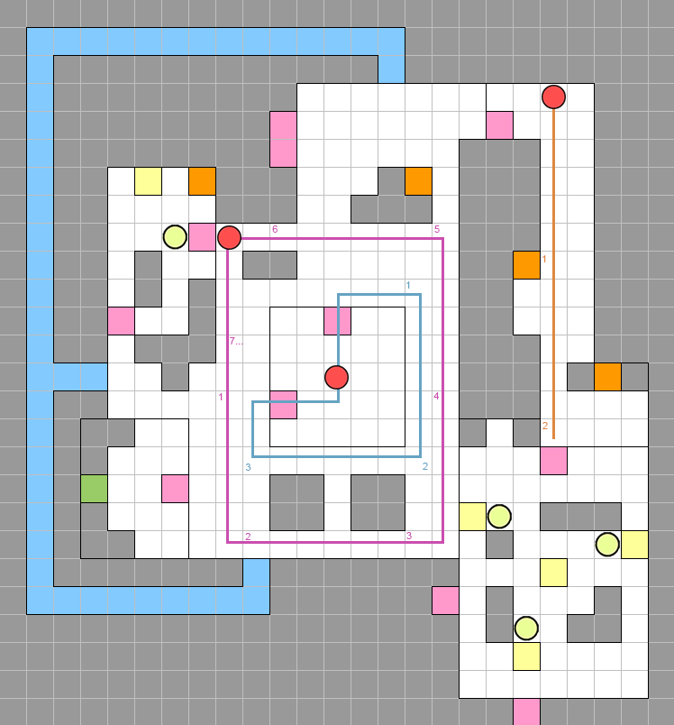
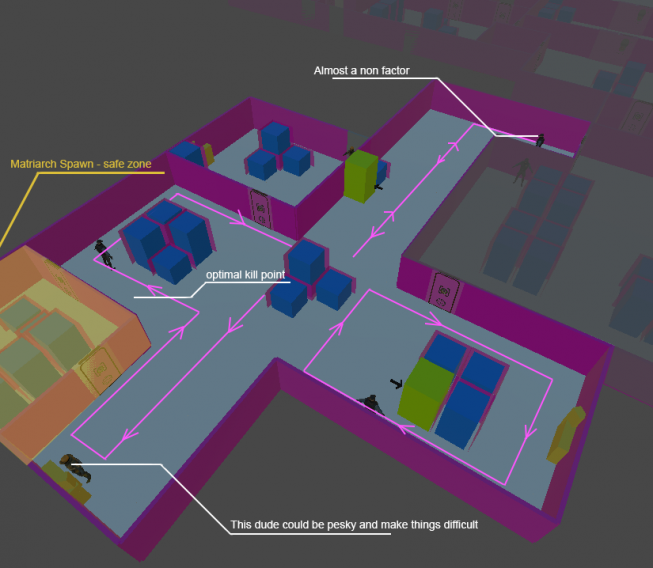
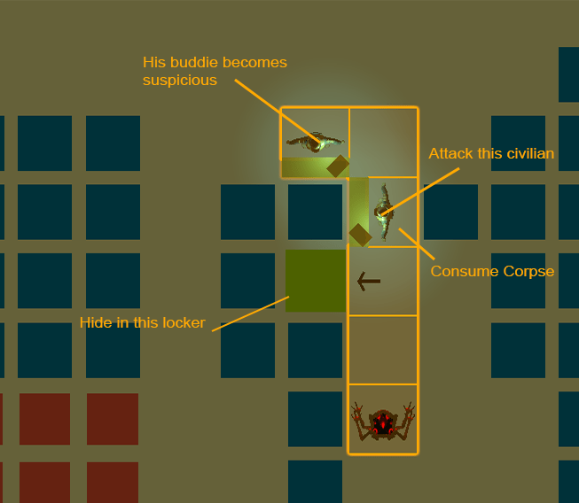
Difficulty was balanced not only in the placement of cover, hiding spots and the number/type of enemies we hurled at the player, but also by the proximity between said enemies. Sound played a large rold in the game, so to create a harder scenario, the enemies patrols were placed to coincide with each other regularaly (and vice versea). I designed each patrol to have a number of “attack points” where the player could successfully kill each unit without alerting those nearby, but it often required the player to scout out, watch and plan their attack (Hint: it was never that simple for a lot of players). A similar result could be achieved with doors; breaking a larger room into smaller ones with doors (which provoked suspicioun from nearby humans) could make what was once a relatively easy combat scenario into a much hard one simply because navigating through the area undetected was much harder.
Screenshots
