Category: cp_nautilus

Dev Blog : cp_nautilus_a4

Introduction

Like a fart in the wind, alpha 3 came and went with naught but a wrinkled nose and a mutter of “smells a little odd in here”. There were 2 playtests for a3, one that I managed to play in, the other one I did not (and it’s sods law that the one I was unable to attend had almost twice the number of players). Alas we strive on! The biggest problem was that I forgot to change the capping times from “dev” to “test”, so teams were capping points in 5 seconds as opposed to desired 15. See, I want to spend as little time as possible testing out things I already know work, so by setting the cap time to something ridiculous like 5 seconds, I can run through the map very quickly making sure everything else works. Simple… I just need to remember to change them back. And the biggest problem with something like this being an issue is that EVERY TESTER FEELS THE NEED TO TELL YOU. It’s not that the feedback isn’t useful, it’s just that you only need one or two people telling you it’s wrong for you to get the idea, and if everyone is telling you the capping time is too low, they aren’t focusing on other more important things like “map is confusing”, “This sightline is busted”, “Spies are terrible here because there’s no great ammo routes” etc – Basically stuff that I hadn’t noticed, that I could iterate on. It’s one of the main reasons you should clip alpha stages of your map. Because if you don’t, players never shut up about it, they get fixated on it and it distracts from your playtest.

Now don’t get me wrong. This isn’t the tester’s fault at all; This rather morbid smelling slip of gas is completely on me, and I know for a fact that if I was playtesting a game or a map and there was a giant Error message on my screen, i’d probably point it out too. But it does sort of soil the whole testing experience.

Alpha 3

That saiddddddd, both play tests offered me great feedback, although I sort of knew going in what one of the MAJOR flaws in Nautilus was; BLU spawn. With the Alpha 3 overhaul I did just enough to make this section playable but knew it wasn’t great, that said the minute I started properly running around it and testing it out, I realised it was worse that I initially anticipated.

  • BLU spawn was too close to Point A

It was far too close to the spawn for one thing and the routes were just corridors (there was no meaningful or fun combat zones that the players could actively fight in). Typically there’s an open area when BLU initially run to their death upon the spawn doors opening, followed by some connecting rooms that lead to the first point. This allows RED a chance to hold off BLU and let the time count down before inevitably having to fall back to the point to defend. Nautilus didn’t have that. Instead players could run straight from the spawn, through a few corridors and right onto the point with little to no meaningful resistance. Coupled with the botched cap time and it was safe to say that RED weren’t happy. The first port of call was to open some of the early sections of the map up even further as well as move the point away from the BLU spawn.

  • The lower path now lead to nowhere

Another issue which manifested itself from the redesign was that right path lead to a lower level that sort of went nowhere. It originally led to the point but after hacking apart A in alpha 3 the area seemed a little redundant. I had a thought that it would allow demos and soldiers a chance to get some height on the point, but they could do that anyway (and without damage) via the middle route. So the area was just a bit of a waste.

When BLU got to the point problems went from bad to worse for RED as the small area for the teams to fight in meant sentry guns were useless and what small defence RED had could be wiped out reasonably easily. Overall A and BLU spawn held on to too much of the original design and the end result was just a bit of a mess. And the cherry on top of all this trash was the giant sight line from RED forward spawn to the point that I somehow managed to miss. It was clear that I was going to need to strip all this out and start again.

  • Navigation was still a mess

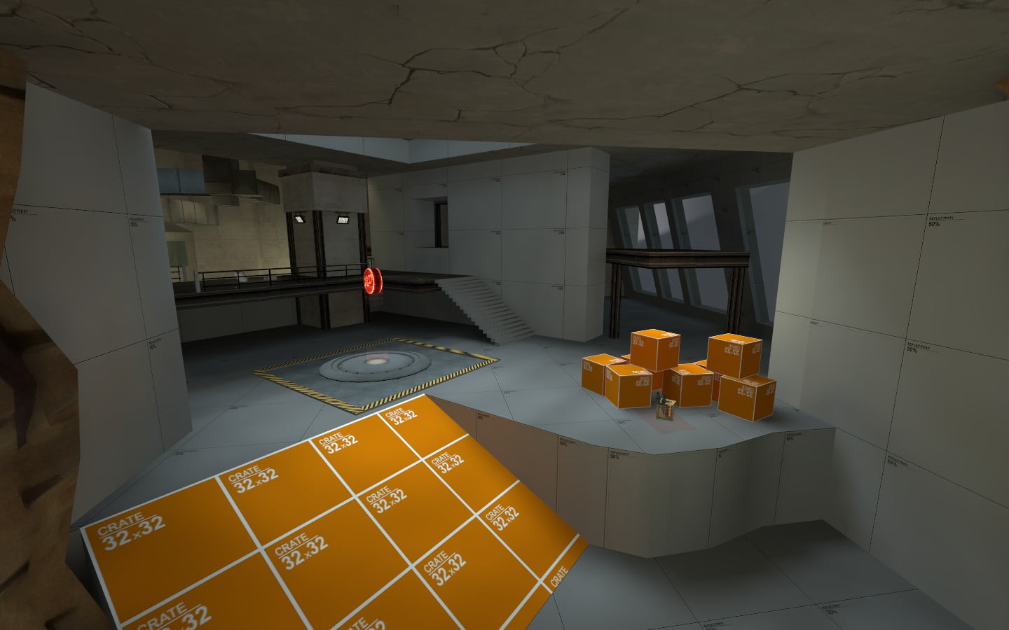
Other sections didn’t fare much better; For some reason I removed the stairs out of the far side of B’s pit in alpha 3 and as such falling in there was practically a death sentence as the stairs to the left were the only way out (short of rocket jumping). Thinking back I think it might have been to make space for the huge and out of place ramp down to the lower levels of C… my bad. The main route from the final red spawn to B was also a nightmare for many not really knowing where to go. In fact navigation throughout the whole level was generally a nightmare with players frequently getting lost. This is the problem with working on something so closely for such a long time is that you’ve got the layout memorised, you could fly through it in your sleep! But hand it someone completely new and there’s a good chance that of the 3 direct routes to the point, they’ll take the 4th and end up in the ass end of nowhere. And so once again, I picked up my hammer for we had some building to do.

Alpha 4

  • BLU spawnroom update

Ooft another big one, lets get too it! First I completely rebuilt the spawn room. Typically in Team Fortress 2, spawns rooms for the blue team start in a single room and then branch out of the antechamber into a much large room with multiple exists for attack. This is to prevent spawn camping and cramming everyone into a tiny room. The previous spawn room was guilty of this so it had to go. It’s still not perfect in my eyes (would ideally like it even bigger!) but it’s a start.

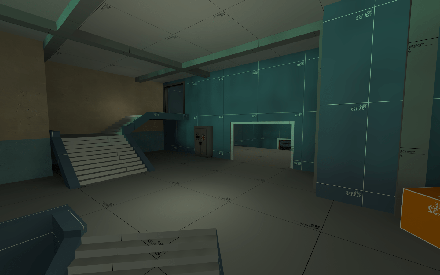
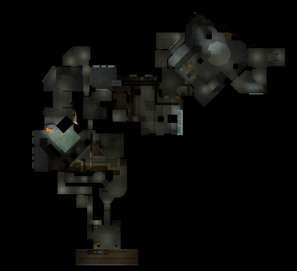
BLU’s spawn room got a complete makeover

And now it even has an antechamber!

From the screenshots you can also see that the lighting has changed. In an attempt to actually make the name cp_Nautilus make sense, I’ve tried to give it a more aquatic colour scheme. It’s very much in it’s experimental phase right now, but as the next few updates come out, i’m hoping to solidify the lighting and underwater skybox.

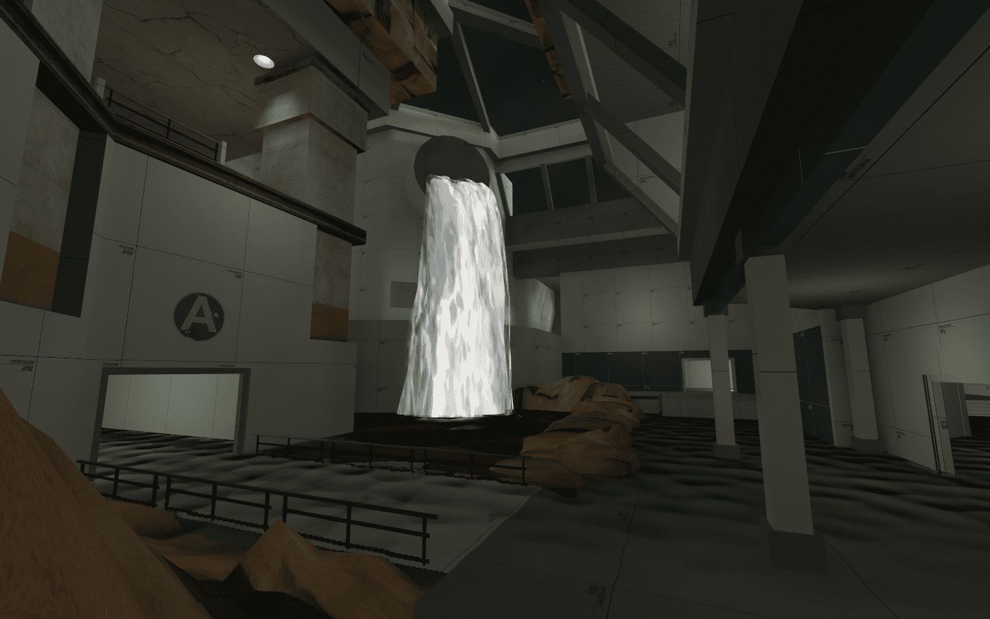
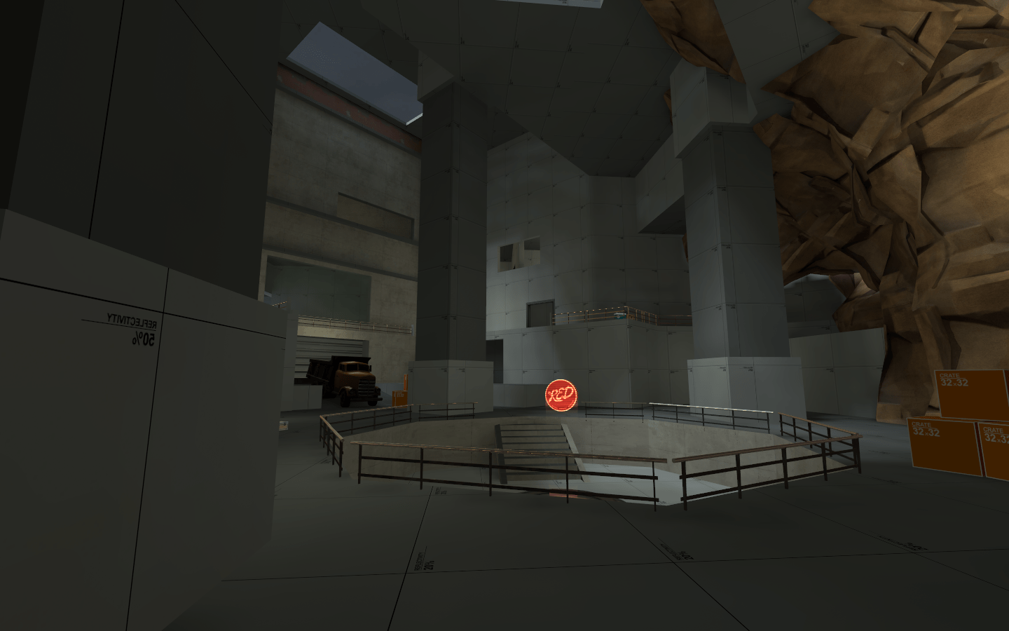
  • Burn it all down! And by that I mean Point A

I stripped all of the starting area out save for a few elements that I actually quite liked. So let’s start with the giant pointless middle section. It served ZERO purpose in Alpha 3 acting as a little spot for players to run down, look around, shrug and then ultimately get killed by a stray Demoman pill – fun right? I wasn’t 100% what i wanted to do with this area, just that I wanted it to be grand! In Alpha 3 the structure in front of the point felt a little… weird. It didn’t make sense; “why was it there? Why did the architect decide it was needed!? That said, I actually quite liked the structure of it and wanted to try and preserve it in some way.

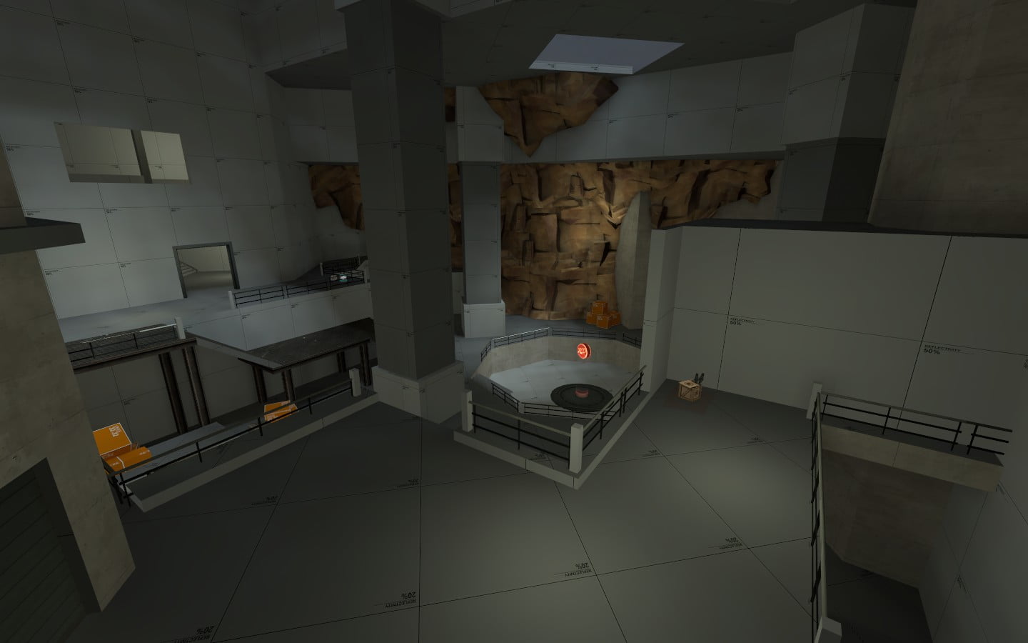
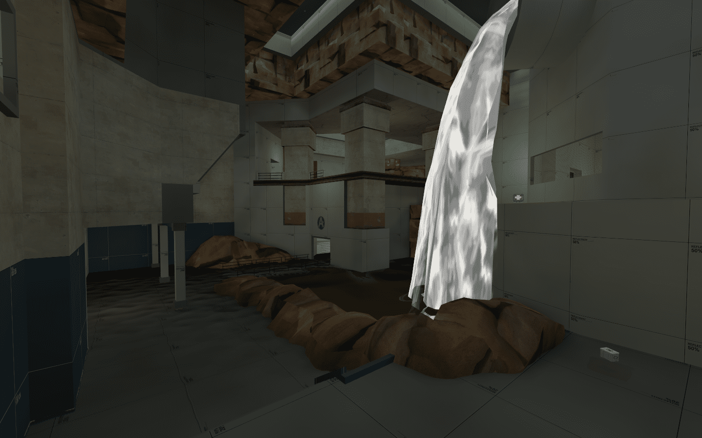
The main room was completely opened up allowing more room to breath. It’s still not perfect, but it’s a huge step in the right direction

So I kept what i could and started hacking apart the rest. I drastically raised the ceiling and spread out the geometry. The old A had a very claustrophobic feel which many people complained about. These changes were designed to fix that.

I also really liked the idea of flooding the lower level. There’s something about water maps that I really enjoy, and I feel mappers are often hesitant to add large amounts of it to their tf2 maps (let alone incorporate it into their gameplay). Let’s face it, the Water Temple is the second best dungeon in OOT.

At first I was going to have a lower passage almost fully submerge the player underwater leading to a longer and more dangerous route that would appear behind the point allowing for ambushes, but felt that was maybe a bit over the top. So I instead settled for a giant overflowing pool in the main room that’s subsequently flooded the lowest level of the map up to about shin height. I was informed during playtest that if it’s too high it can negatively impact rocket jumping but no one seemed to actually experience this. A lot of people liked the theme though, so it’s definitely something i might push further.

Point A’s “fight” area was made far larger, the top passage allowed for a quick route to the point but is poor in cover so players risk getting picked off by snipers and sentry guns down the corridor. A lower route was added which connected to the main hall. This was the longest of the routes but appeared behind the point offer great ambushing potentials for spies and scouts. After watching a few games and thinking more about this route, i’m not actually the biggest fan of it and instead might have it go under the points instead in Alpha 5. The middle route takes players to the right either behind the waterfall or through the sub room. It’s very similar to alpha 3’s route, but takes a little longer.

Point A was opened up allowing for less CQC

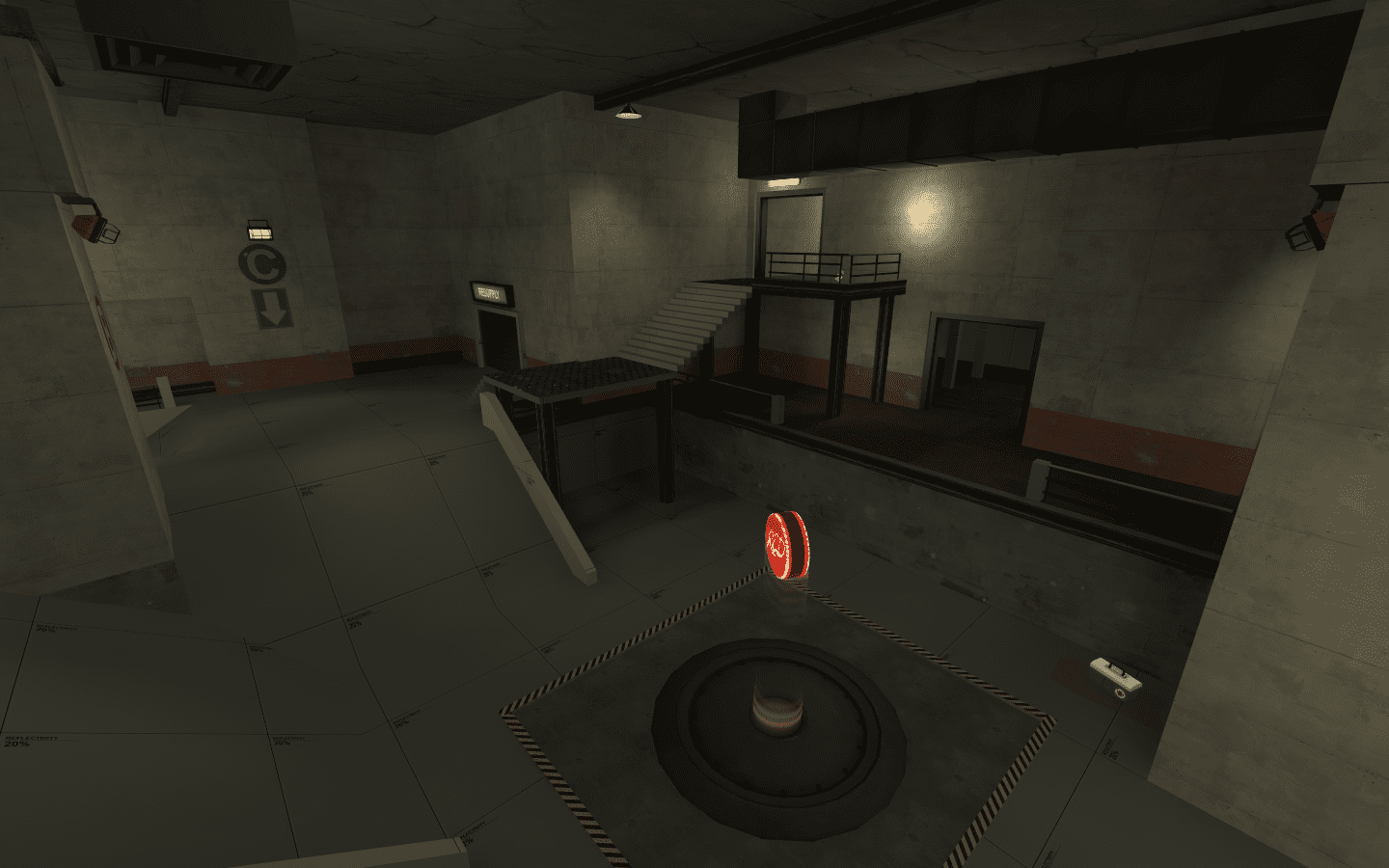
  • Rebuilt RED forward spawn

That nasty sight line had to go so i moved the whole spawn room back around the corner and rebuilt it to better suit it’s new position. Someone actually complimented how it looked which was nice since it’s entirely dev brushes. I agree with this individual, it DOES look nice! Too bad it’s getting even more modifications in Alpha 5 – RIP RED forward spawn (a4-a4). Players now had to leave the spawn and follow the arrows around the corner to the point before they could defend it which made for a far more bloody capture of A than in alpha 3 (where they could all stand by the spawn door firing rockets and sniper shots at a completely exposed point).

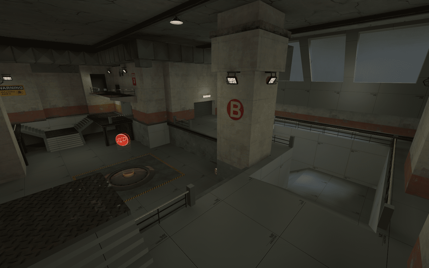
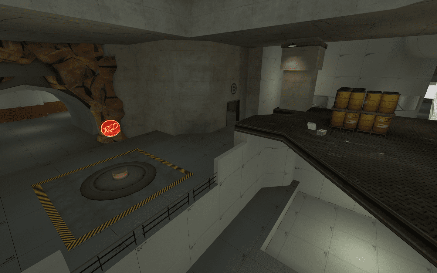
  • Added a BLU forward spawn and re-added ramps at B

People were complaining that they needed to walk a great distance from BLU spawn to C after capping B, and whilst I do sympathise, I just assumed engineers would build teleports… Alas I caved to the pressure and threw one in by B point. While I was there I also made the area a little wider and re-added the ramps.

A forward spawn was added near B for BLU and the ramps made their majestic return

  • General fixes

Finally I fixed the capping timers along with a few clipping issues. Moved a bunch of pickups around to compensate for the new geometry changes and replaced a bunch of the crate brushes with actual props as people were complaining the off grid brush was messing with their sticky bombs.

Conclusion

And there is alpha 4! It’s been uploaded now for over a month so I’ve already watched a few playtests of it (was unfortunately down South for Christmas so didn’t get a chance to play in any =[ ). Now that the Christmas holidays are officially over I’m ready to ramp back up to speed and get Alpha 5 on the go! Lots of changes to B coming in the future; it’s holding on to too much of the alpha 2 past and must be stripped away for fresh new and more interesting ideas! Nautilus is moving in the right direction, but there’s still a huge amount of work to do!

Dev Blog : cp_nautilus_a3

A note regarding version numbers

cp_nautilus_a1 and a2 were almost entirely identical with a2 being released a day later fixing a bunch of simple gameplay issues in a1 that should have been there on release; lack of clipping brushes on stairs, lack of nobuild brushes in grated off areas and actually adding health/ammo pickups etc – hey we all make mistakes on our first upload.

Introduction

Around April 2015 I started work on my first actual Source map. I’d always wanted to create TF2 maps; Having sunk a good 1000 hours of my childhood into the game, I figured i had the game knowledge down and as someone who wanted to move into level design it seemed only fitting that I started mapping. But prior to that, I had neither the time, knowledge nor motivation to learn how to create a map in Hammer (great for an aspiring level designer, I know).

Redundancy from my first job then hit and I suddenly had an abundance of time and inspiration on my hands (it’s surprising how the desire to not starve motivates a person). And so, out of the dust that was my first job in the industry came cp_nautilus_a2! And well… it was a hot mess. A valiant effort (so I’ve been told) for a first attempt at a map, but still a mess of brushes, meshes and level logic that sort of fuse into something resembling a TF2 map.

cp_nautilus_a2 was a 3 point Attack/Defend CP map. For those who don’t play TF2, Attack/Defend maps revolve around BLU team needing to push and capture one point after the other (usually in an linear sequence), whilst RED team set up defences and hold off at each point for as long as they can. BLU team wins if all points are captured and RED wins if they hold out until the round timer reaches 0.

I really like attack/defend style maps; they offer a certain “narrative” to a multiplayer map that’s missing from regular 5 point symmetrical CP maps. There’s a definitive start, middle and end which allows room for a designer to outline a story within the flow of the level;

“Players start on a train, they push into the station and then onto the streets, through alleys and the city square, reaching the climax and a final showdown infront of city hall”.

All you then need is the players to fill in the pieces. Anyone who’s played a multiplayer shooter has had that one game where the round timer is almost up and your team makes the Hail Mary push that wins you the game. Attack/Defence maps accommodate this narrative really well and is why, in my opinion, they are so highly rated in the TF2 community (Dustbowl despite it’s flaws is the second most played map after 2Fort and even the most hardened of TF2 players can’t tell you exactly why 2Fort is so popular as it’s a pretty terrible map all things considered).

Alpha 2

“Birth” – cp_nautilus_a2

Why Nautilus? The original theme was to be an underwater facility of some sort. As such it was dark, dank, grimy and generally an unappealing place – this would subsequently be a regular complaint the map received as TF2 is traditionally a bright colourful experience, and many didn’t think the “grittier” feel suited the style of the game. But on top of that, the map just wasn’t that great. So what made the map such a mess?

  •  From a design perspective it was a navigational nightmare 

BLU team exit the spawn from one of two exits; the left path leads BLU into either this side building or up a ramp to the upper level, whilst the right path offers 4 routes (one to the left path, one to the upper level, one to point A and one to point B). Despite the navigational signs, the flow of the right path naturally leads players to Point B which was a common issue in the first play through and the left path took the players through the building down a random side passage. Neither path’s natural flow took the player to Point A which led to many players getting lost in the belly of the map before even capturing the first point.

The lack of a forward spawn for RED meant that all defenders were also spawning at the very back of the map and needing to trek past Point C and B just to reach the initial point of combat. The layout was just too confusing for many new players and no amount of arrows was likely to help.

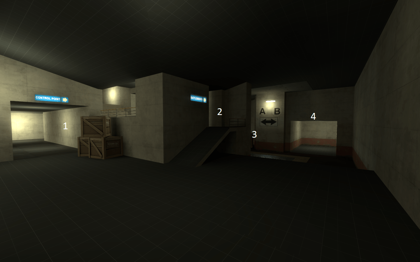
Straight out of the BLU spawn there were 4 possible routes for the player to take. The natural flow always took them to 4 which was the one i didn’t want them to initially take.

  • It was a technical mess

I’ll cut myself some slack on this one as it was my first map, but there were a bunch technical blunders that made iterating on the map somewhat awkward. The entire map was built on a grid size of 1; this is not only evidence of sloppy brushwork, but also meant even the most minor of changes risked creating a leak. Clipping brushes on the spawn doors didn’t block projectiles meaning players could kill each other before the round started. The displacements used around Point A and C were laughable (and still are in a3). Stair height and width weren’t in keeping with official TF2 standards, it all just screamed amateur, which is totally understandable (i had only been mapping for a month at that point); But fixing these problems would be a mammoth task and one i wasn’t too eager to engage upon at the time.

  • It was detailed too early

I made the excuse back in a2 that the reason I was detailing early was to give myself a feel for the theme and setting, as well as refine some of the layout design. In hindsight this was a terrible excuse and it subsequently hurt the map. Small detailing is fine, it makes an alpha map look a little more than just a bunch of brushes thrown around. But too much and iteration becomes difficult. I remember opening this map and being faced with an mess of brushes and meshes. It was exhausting to even look at, let alone start to make changes to.

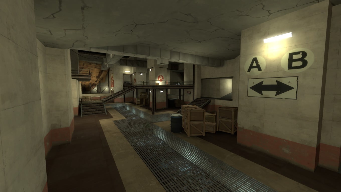
This is way too detailed for an A1 version of a map (to be honest it’s too detailed for even a B1).

  • It was half finished

On the complete opposite end of the spectrum, Point C was sort of “half assed”. There were long empty rooms with nothing in them except boring geometry that served only as a way of connecting one point to another. The consistency was just jarring.

A few rooms were just boring and empty. You can definitely see the exact point of the map where i stopped caring.

  • Did anything go right?

Behind all this negativity however, there was actually a huge amount of positive gain from nautilus. It got me involved with the TF2 mapping community, it taught me the importance of testing early, testing frequently. I actually had a working map (which is more than can be said for future projects) and i learnt a lot about the Source engine in general. But for the most part I saw it as an unsalvageable project.

And so the map gathered dust. I found a new job shortly after the release of a2 so decided to shelve nautilus, reopening it a few times in some wild attempt to fix it, but nothing ever materialised. It served as a reminder to me as to “what not to do” when making a map and taught me a lot about the mapping development process. I would go on over the next 2 years to build a bunch new levels, only some of which getting close to a1, but nothing to the scale of nautilus.

Alpha 3

“The Rebirth” – cp_nautilus_a3

Until now baby! WOOOOOOO. cp_nautilus_a3 was uploaded to TF2Maps.com 4 days ago and we are good to spin it for another round! I can’t remember what gave me the idea to go back to this monstrosity, but i’m glad I’m did as the rework of nautilus has rekindled that drive to get a map out of the alpha stage and onto the workshop!

Oh boy where do i begin with this one;

  • Fixing those darn technical issues

Before any major work could begin on the layout, the entire thing needed to be moved onto a larger grid. So the previous map was moved onto a grid size of 4. I would have liked it on something larger like 16, but I went a little crazy with some of the angles so 4 will suffice for now. It is however, far more manageable than it was before which was ultimately the whole point of fixing it up. This took an uncomfortably large amount of time to change, so people take note; DON’T BUILD ON A GRID SIZE OF < 4.

The stairs and door frames were all rebuilt to the proper standardised scale, and the spawn doors were fixed to prevent those pesky bullets, pills and rockets entering the spawn rooms. The forward spawn for RED was also added and working (although for some reason it churns out a bunch of console errors that seem to have zero impact of the functionality of the spawn room… will look into that one later).

  • Rebuilding of Point A and C

Point A and C recieved large geometry overhauls. I tried to keep as much of the original layout as possible (building on top of trash is often better than building from scratch), so whatever geometry could be salvaged was.

Point A had the right path blocked up only offering BLU 2 choices (one to the upper level, the other to the Point) and the left path had the awkward side room stripped out now only offering the player one route to the point. It’s more linear and streamlined (some might say too linear) but will hopefully allow for an easier navigation route to point A. A RED forward spawn was added down the end of the tunnel (with a second door exiting onto the centre HUB room) that offered the defence a direct path to A. Fingers crossed players actually make it to the correct point this time!

Point A was completely rebuilt,opened up and rotated 45°

I added some giant windows and a skybox as people complained about the lack of natural lighting and replaced that horrid corridor connect A to B with a much nicer connecting room. The centre “HUB” connecting room was slightly adjusted to accommodate for the new layout changes and the whole point of A was placed at a 45° angle to offer a more visually appealing and interesting layout (I’ll touch on this later, but upon reflection I feel it was a mistake).

Point B mostly had it’s detail stripped out and the layout of the room simplified. Also added a giant ramp down to the lower level

Not much change to Point B. A an awkward ramp was ham-fisted in to connect it to the lower levels of C (this will most likely get remade in the next update) and the original connection to C on the east wall was blocked off.

Point C however, was the shining beacon that made this update for me. It’s a three tiered descent down to the control point that obvious favours attackers but from a narrative perspective It feels like a satisfying end to a 3 point attack/defend map (I’m going to make it work… somehow). The large open area and obvious height advantage to BLU offers demos, soldiers and Snipers crazy good sight lines so that’s definitely something I’m going to have to keep an eye on.  More routes and cover are definitely needed to allow RED to reach some of the higher levels undamaged/detected, but its a huge step forward in the maps layout and now serves as the “money shot”.

[twentytwenty]

The final point is a 3 storey descent into the depths of the mountain

  • Stripped out the detail

a3 might actually look like a step backwards from a2 visually, but honestly I think it was for the best. The detail can be added back in when needed, but for now a quick pipeline that allows for fast iteration and compiling is crucial and that just wasn’t happening in a2. I’m still working on what i want to achieve with this visually, but I have some ideas that I think will work quite nicely.

Post Alpha 3

So going forward what needs doing:

  • Lots of play testing!

I have a plan to get at least 2 tests of cp_nautilus_a3 done before considering any changes. I know what I want to do with some parts of the map, would like some actually play time in it first before I go ahead.

  • More geometry changes

Point A is still a mess. I put this almost entirely down to the fact that I tried to maintain as much of the previous version as I could. I also blame the 45° angle change i made last minute. It was poorly thought through and as a result has some really weird geometry around A. Furthermore, it’s WAY too close to the first point. I’m surprised this was never brought up in the original play test of a2, but time from spawn to first contact at A is really short and needs to be extended. a4 will likely see another overhaul of this point.

Point B is going to get some more love as well. It’s a little cramped and honestly not that interesting of a combat area. I’ll likely make some small changes at first and if I’m not satisfied I might burn the whole centre section to the ground and build it from scratch… I’ll see how I feel on the day.

Conclusion

So there we have it. After 2 and a half years of sitting on my hard drive, cp_nautilus is back on the construction line and with all the ideas and experience I have accumulated from those years ready to be unleashed, I’m excited to see what the future brings.