
To quote a comment I made in the “From The Vault” blog post a couple of weeks back regarding pl_carapace:
“I still have the VMF file for this map, however I don’t see myself doing any further work to it. I would rather commit that time to working on a new urban map “
Intrduction
So that was a lie
At the beginning of the year, I had been toying with the idea of making a new Team Fortress 2 map. I wanted to take something from concept, through development and ultimately release it on the Steam Workshop. I set myself a deadline of 12 months (a pretty reasonable amount of time for a side project I would work on in my spare time) and was going to make use of all the level design teachings and learnings I had acquired over the last 3 years. During January I gathered reference images and did some foundation work that all designers should do before starting a level. However when February came, I’d had already given up on the idea. I was so busy doing other things in my life that I just couldn’t commit the required energy and hours of an evening to working on a map. I hesitate to even say the project was dead upon arrival (it was dead before it had left the house).
2 weeks later I would be out of a job. I had known things weren’t looking amazing at work; we were hunting for a publisher in a economic climate where companies and investors were tightening their belts. What took me by surprise however was the immediacy of it all. I went from having a meeting Monday morning about what work I was planning to do that sprint, to being told I was to go home and start looking for new work (all within an hour).

This had given me a second wind on the urban map I had planned, and after finding the .vmf of pl_crapace for the blog post, I realised it really didn’t make all that much sense to start something from scratch. The map was there; it worked, it just needed a little love.

2 weeks later, it turns out it needed a lot of love. I’ll be honest, this update was brutal. I was working on the map ~12 hours a day, 6 days a week, and each day I felt like I was making less and less progress. This was not a sustainable way to work, however I was determined to complete the update and get it out before the end of March and I’m glad I persisted. I truly believe that I have broken the back of the work on this.
It was gruelling and tiring, and I’m certainly a little burnt out… but it was worth it and I look forward to the first playtest of pl_carapace_a3. Let’s dive into the update.
Alpha 2
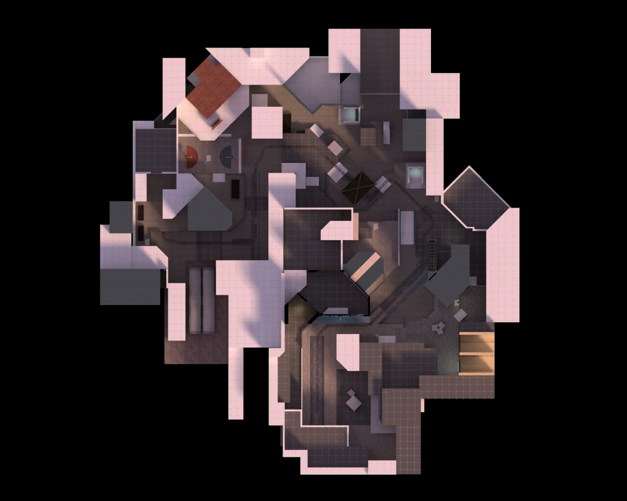
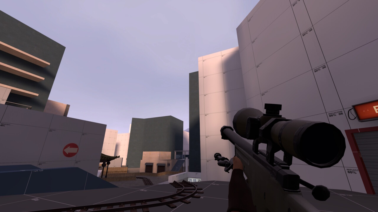
I should probably talk generally about the alpha 2 version of this map before diving into the overhaul that alpha 3 went through. The map was originally made in 72 hours over a weekend in 2020; it was a payload map that took the players and the payload through an urban city ultimately ending up on a subway station. I wanted to capture the tone and aesthetic of koth_kong but in the payload game mode. I failed miserably at this! I don’t beat myself up too hard about it; creating a map in a 72 hour jam is a draining marathon, so even getting a map working and submitted is a success in my books. However I couldn’t look at the map and see it as anything other than a failure in meeting it’s original goals.

- A failure in tone
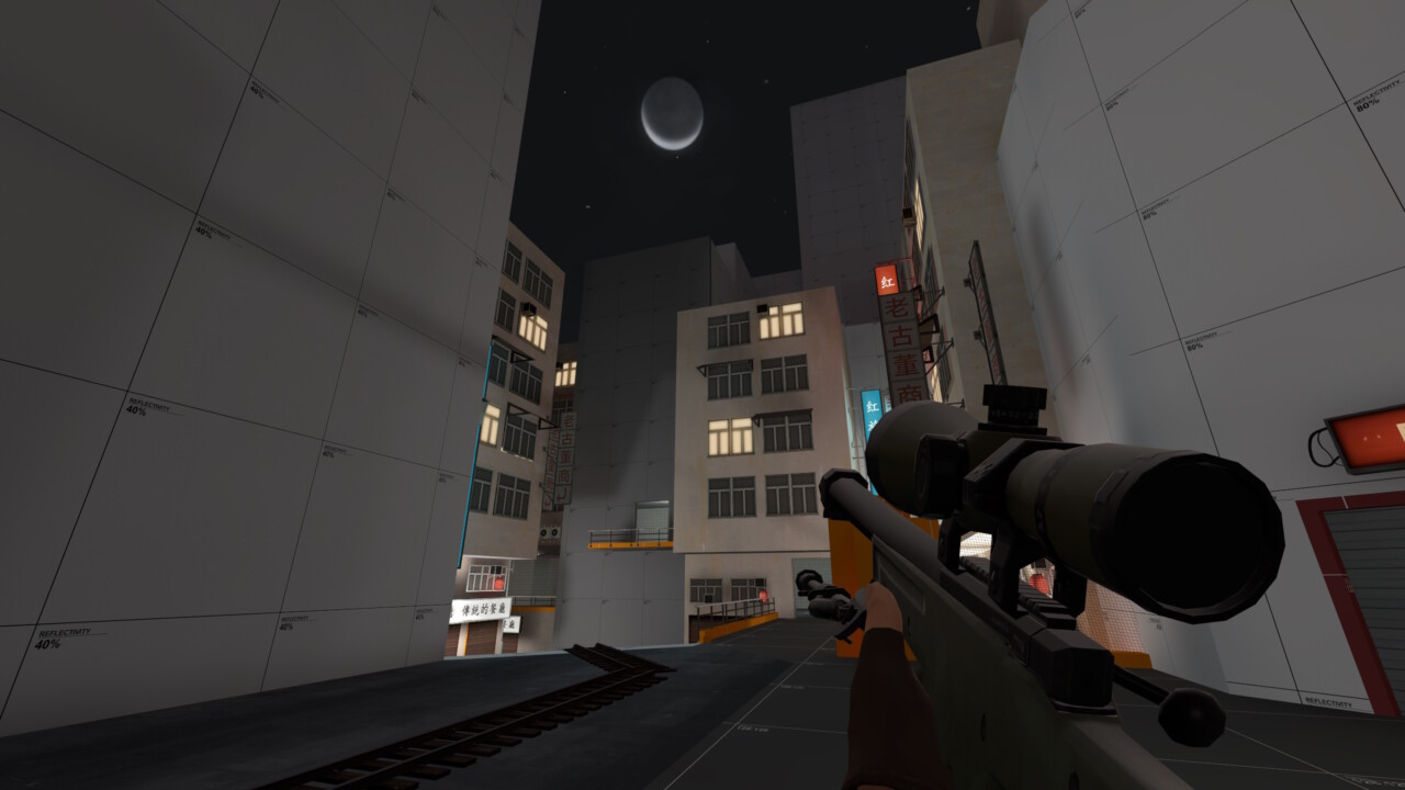
I have no idea why I set the map during the day when koth_kong’s aesthetic work so well due to it night time skybox. Lights and signs pop far more effectively in a darker setting and the general tone is slightly more mysterious. You lose all of this in a day time setting and I can only assume I set it during the day for development purposes and then just forgot to change it.
- A failure in theme
The layout itself feels less like a city and more like a random assortment of geometry scattered about a sandbox for players to run around in. The city skyline isn’t varied or high enough, meaning I never felt like I was actually in a larger city that was looming down on me.
- A failure in gameplay
And ultimately the layout offered a few too many side paths for players to get lost in. The player focus is taken away from the cart, and so the gameplay itself suffers as a result (I actually think I might have over compensated for this in alpha 3, but I’ll get to that further down).

At the time of writing this post, the map has been downloaded 374 times on TF2maps.net and the only comment was left by a forum user, 3 years after the Jam, who really seemed like it for some reason. Huh – thanks chief!
With these problems identified, lets get working on fixing this map up!
Alpha 3
- General Fixes
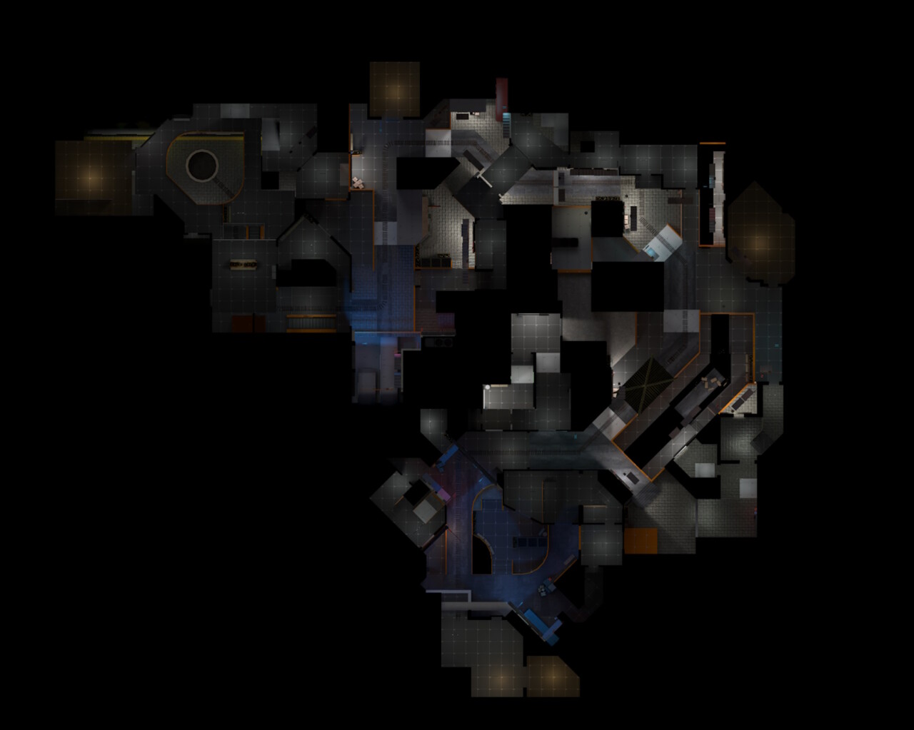
First thing I set about doing was changing the skybox to night time. An easy change, and it definitely took the map one step closer to nailing the tone I was looking for. I ended up going for “sky_nightfall_01” and set up the environmental lighting to reflect the skybox change. There’s a really handy resource you can find on valve’s official developer site that gives you the values to plug in.
I also randomly scattered a large number of towering skyscrapers outside of the boundaries of the map to give the effect that there was a larger city this map was situated within. Adding some variety in height and dev textures really gave the city a bit of a depth. In the future I plan on updating this to be a 3D skybox, but given my lack of experience in setting one up, I didn’t really fancy doing it at this stage.
With the easy stuff done and out of the way, I took a shot of tequila and mentally prepared myself for the hours of work ahead of me. I should note that I didn’t work on each section in this order, but it makes sense for me to talk about them in the order the players will experience them.
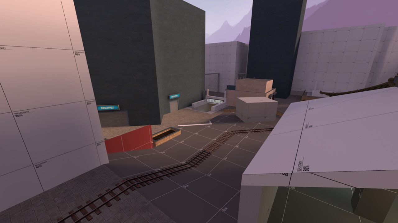
The rework of BLU spawn
If I could describe the start of the map in carapace_a2 it would be… underwhelming and unfocused. Of all the payload starts, this certainly was one of them. I wasn’t entirely sure what the game plan for either side was. BLU team had 4 routes upon leaving spawn:

These flanks were designed give BLU a chance of attacking a RED defence from multiple angles. The start of Payload map is often bloody as RED has had a chance to set up multiple sentry nests and can lock down choke points, preventing the cart from even reach the first point. Give the attacking team options and, with a bit of coordination, its harder for a defending team to create a fortress if attacks are coming from multiple directions. However, these alternate routes brought with them a number of issues. Namely that the focus was drawn away from the payload, i.e. the whole goal of the game mode.
The flanks were quite extreme and extensive often taking BLU team members far away from the action and deep into enemy territory. The far left path (1.) being extremely notorious for this as it has the potential lead an attacking playing all the way back to the final sections of the map without even encountering an enemy player. This would lead to some confusion as to where players were supposed to be going, and detracted gameplay from the more important areas where gameplay was supposed to be happening. It sort of feels like a company cannibalising its own profits by spreading its customers across too many products.
RED team on the other hand suffered from a lack of a defensive positions to hold. There wasn’t really a good spot for engineers to set up Sentry nests (at least not that would be useful for defending a cart push), and because of the 3 flanking routes, the defence had to be spread thin to cover all angles. Overall I didn’t like any of this layout and so decided to cut the attacking routes down from 4 to 2.
The core philosophy with this change was “keep the focus on the cart whilst offering cover and alternate routes for the BLU team”. I don’t think its perfect, but its certainly better. There are 2 routes the attacking team can take
- Push the cart
- Head down to the lower level that acts as a flanking route
Every other route ultimately loops round and returns itself to the track and the payload. I offered the RED team a little enclave to the left where a sentry nest could be set up (which is still vulnerable from snipers and soldiers attacking from the opposite corner). RED team also got a sniper spot above that, which could also prove useful as a safe teleport exit.
I decided to keep the building to the right, but closed off any routes that took the players deeper into the level. For RED it acted as a solid defensive position BLU team would need to flush out if they wanted to protect their rear from attack when pushing the cart towards A, and for BLU it served as some good cover for advancing. I think I might need to reopen up the building to allow players to re-join the payload track at some point (right now they are forced to exit via the lower level which isn’t great, but I’ll see how the map plays out before making that change).
I also added a bit of layered height to the area. It felt a little flat and boring in alpha 2, so this certainly makes the area feel a little more interesting. I’ll see in playtesting if this was the correct choice or not.
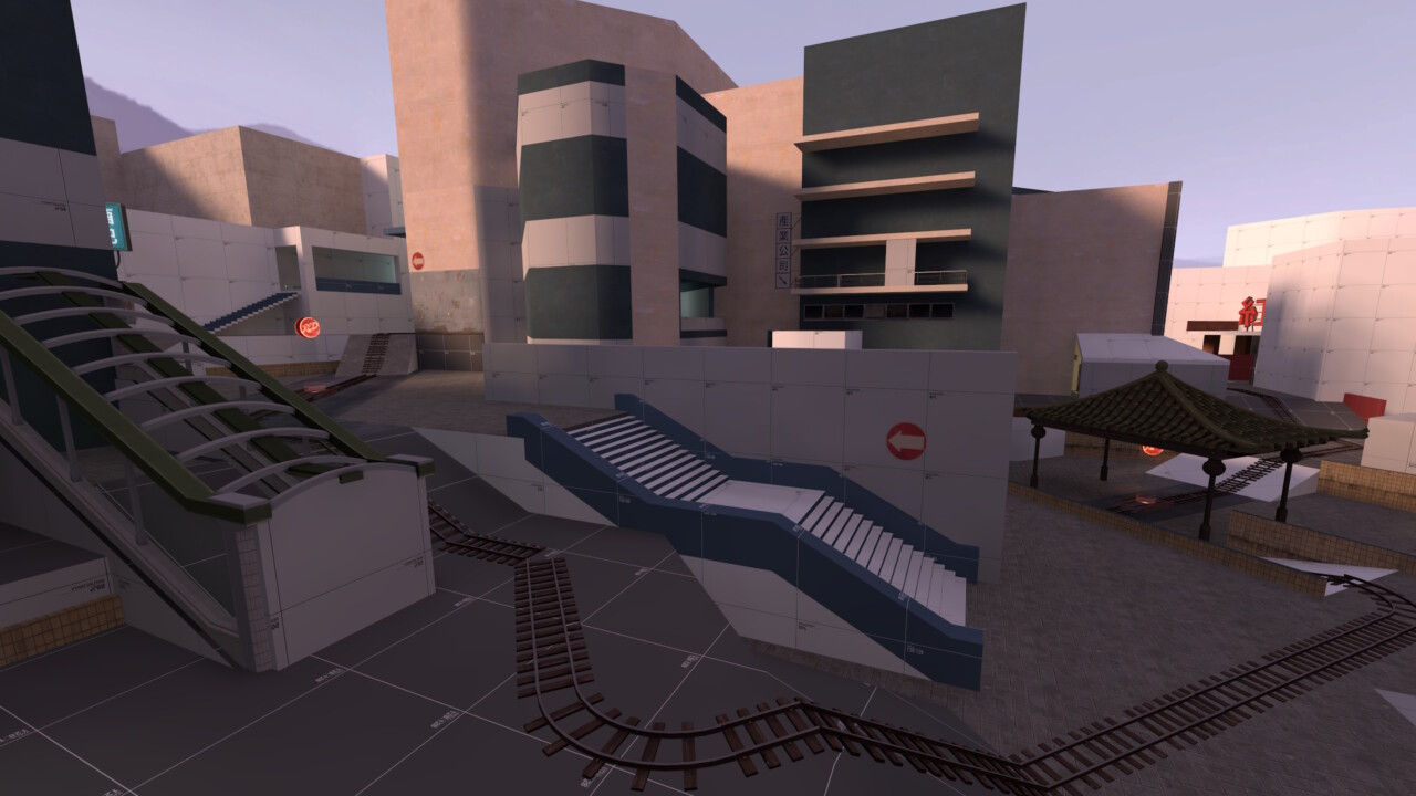
Capture Point A
The original capture point of A suffered from a number of issues. The first (like BLU spawn) was a lack of direction. There were multiple paths sprawling all over the area which lead to a lack of focus on where the gameplay was suppose to occur. I was offering the players too much choice, which ultimately lead to an unfocused messed. The second issue was that it lacked any visual clarity and coherency. It really did feel like a clutter of unorganised greybox cubes, scattered around in an attempt to imitate an urban city.
The new design attempts to rectify some of these problems. The flow of city feels more logical with both the building layout and the payload path following the flow of the newly added canal; taking inspiration from the Cheonggyecheon that runs through Seoul. Attacking players can cross the bridge to the other side to get cover from defensive fire, or alternatively drop down into the canal and enter from the lower level. RED team have a pretty solid spot to the right of the capture point to set up defences, although care should be given to the right as it is a good flanking spot for BLU.
The whole area has been opened up which does however bring with it some gameplay concerns. Namely that there is very little cover now for RED when they are leaving their spawn. Not an issue for setup, but as BLU are pushing closer to the point, I fear this might lead to RED getting slaughtered upon leaving their forward spawn. I’m a little concerned I made this area too open and simple, so this will be a key thing I’ll be keep an eye on in the next playtest.
Capture Point B
In an attempt to make B capture point feel a little more unique, I decided I wanted close it off. That was a stark contrast to A that now felt much more open. I want to give close quarter combat classes a chance to shine, so compacted everything in to this apartment complex. The payload now goes down under the building (inspired by the 3rd point push in pl_badwater) and both attackers and defenders can use the numerous flanking routes to get up and close to each other. I suspect Pyros and Heavies to excel here.
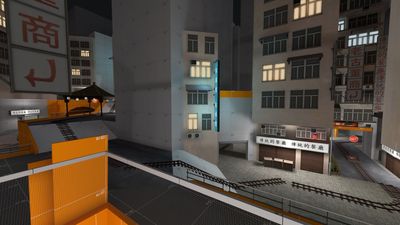
I removed the unnecessary underground path BLU could take to… well, nowhere. And moved the BLU forward spawn a little further up. I fully expect this to be a explosive spamming choke, but that’s by design. You’ve got to allow for it in some places.
BLU team could also get on top the rooftops of some of these buildings using Soldiers, Demo, Scouts and even creative engineers who use their dispensers to climb the wall (I even added a health and ammo pack up there to encourage it). I don’t expect RED to ever use this area, but playtesters always surprise me. Rooftop combat is something I would like to explore in future updates as it would be something that would set it apart from other TF2 maps under the Urban tag, but we’ll wait for a future update to try that out.
Capture Point C
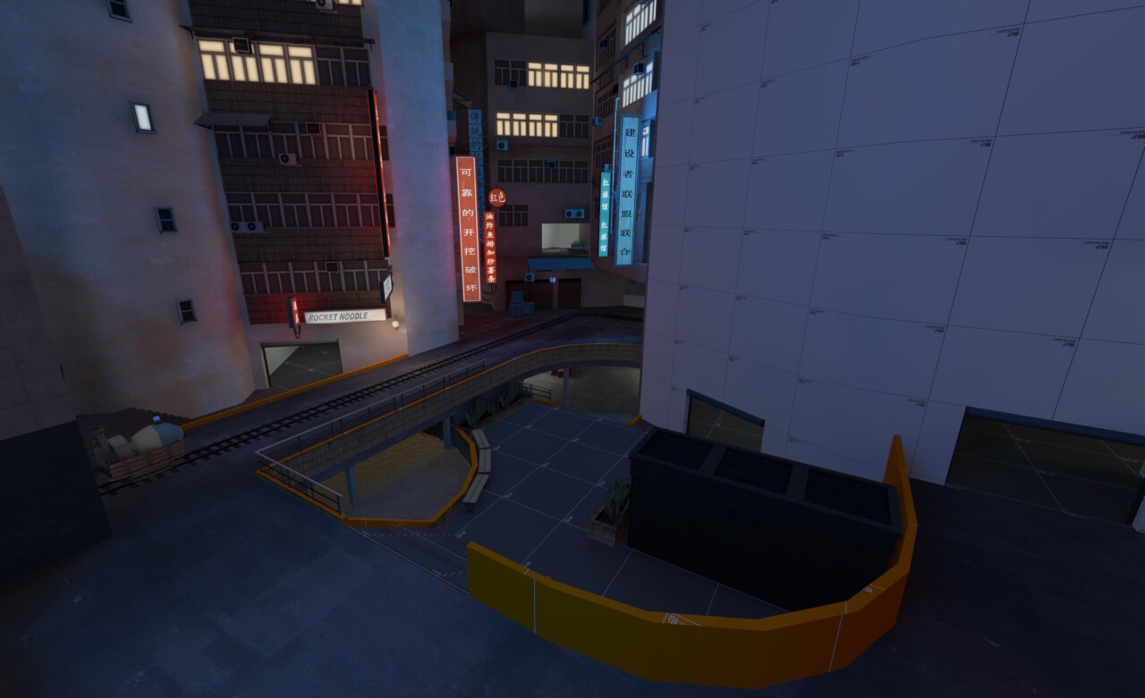
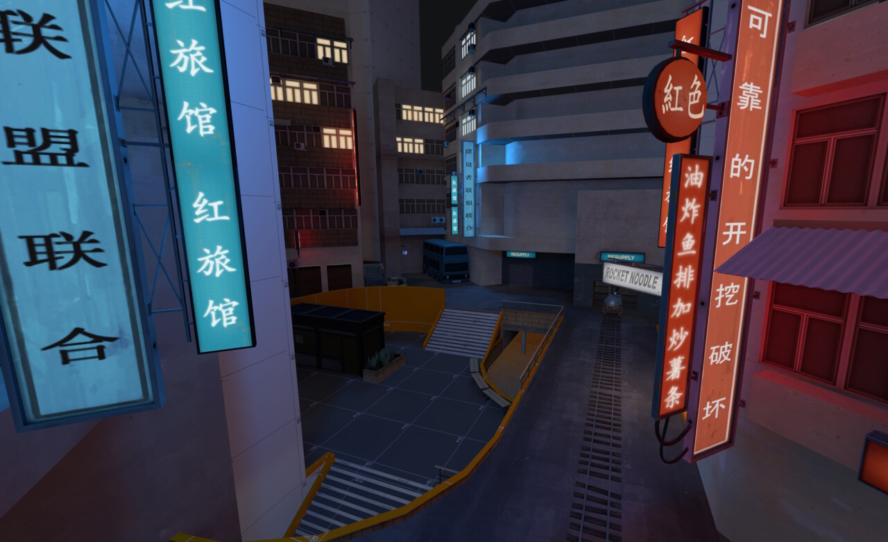
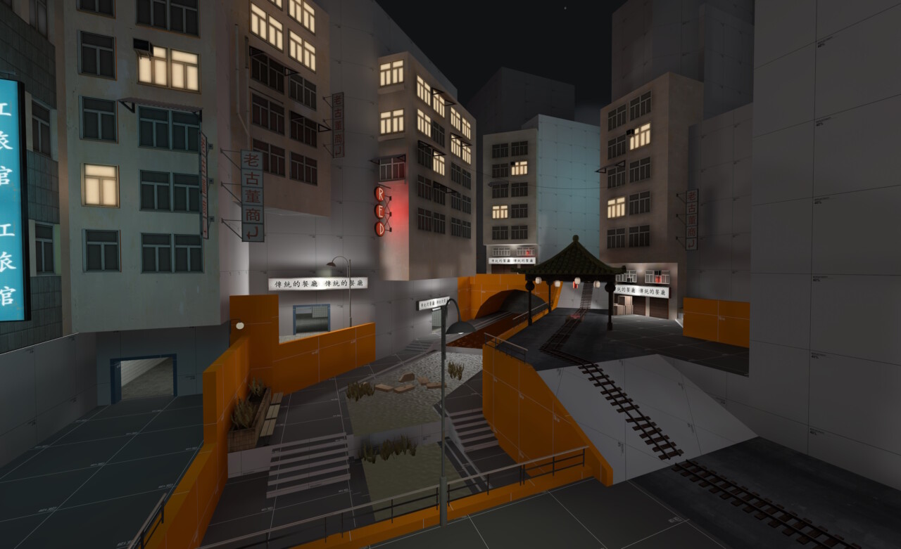
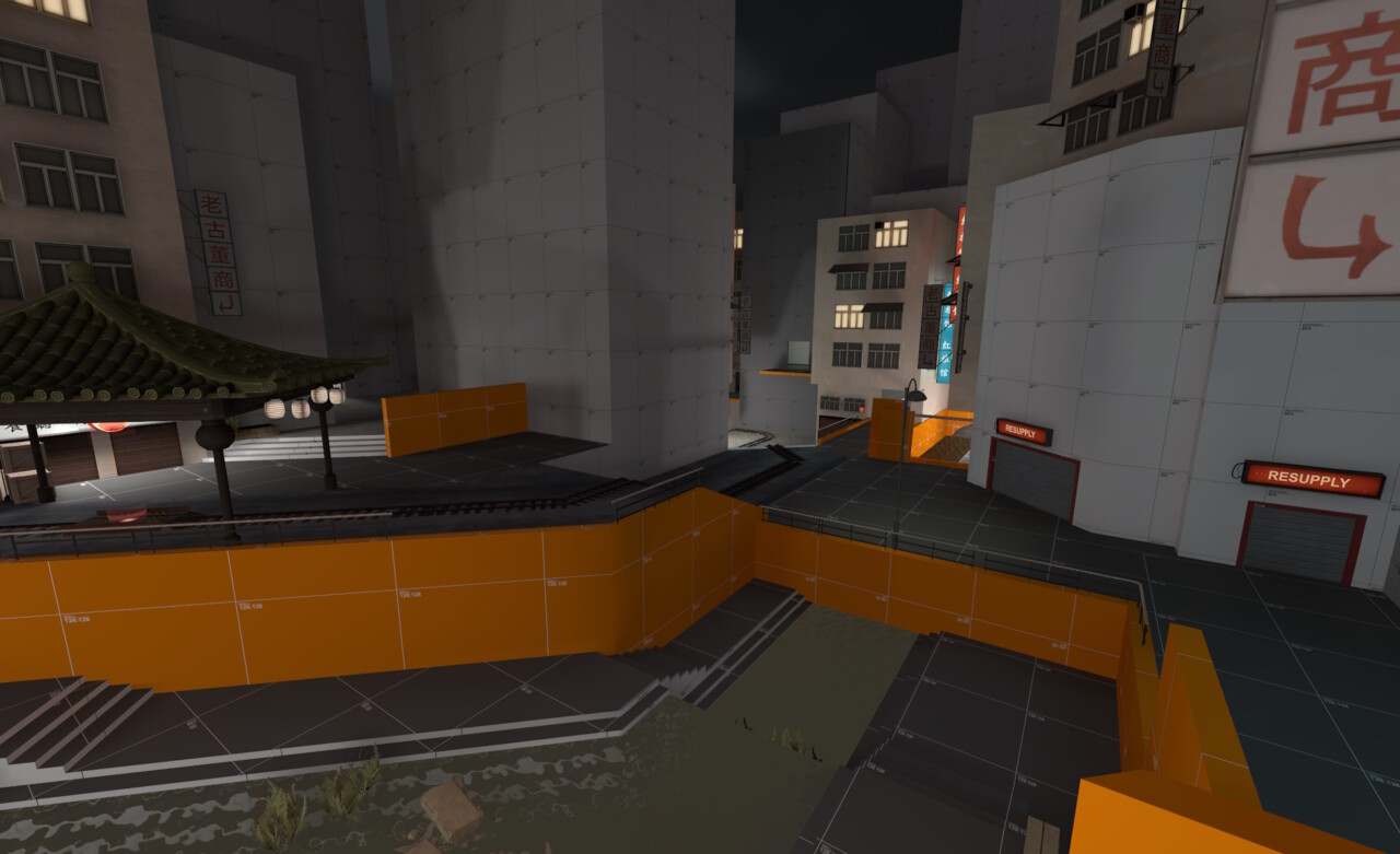
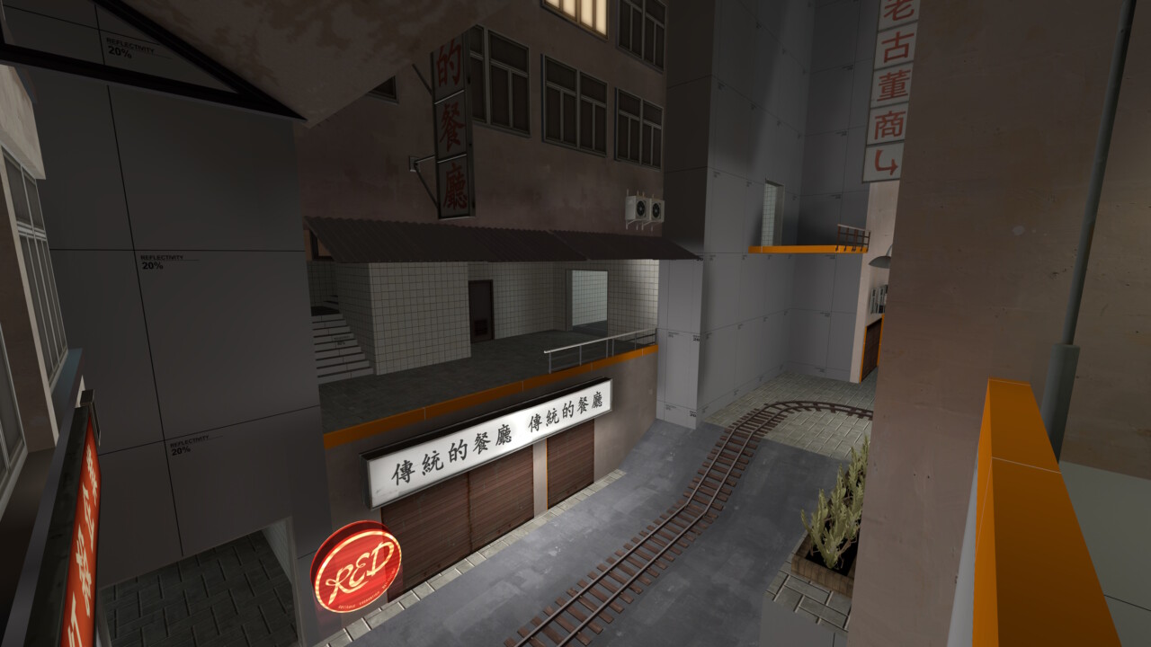
Capture point C remains identical in terms of the payload route, however the surrounding area has had a complete rework. I opened up the route to the right allowing both the RED team to reach the upper flanking routes to defend B, but also for BLU to be able to flank once B has been capped.
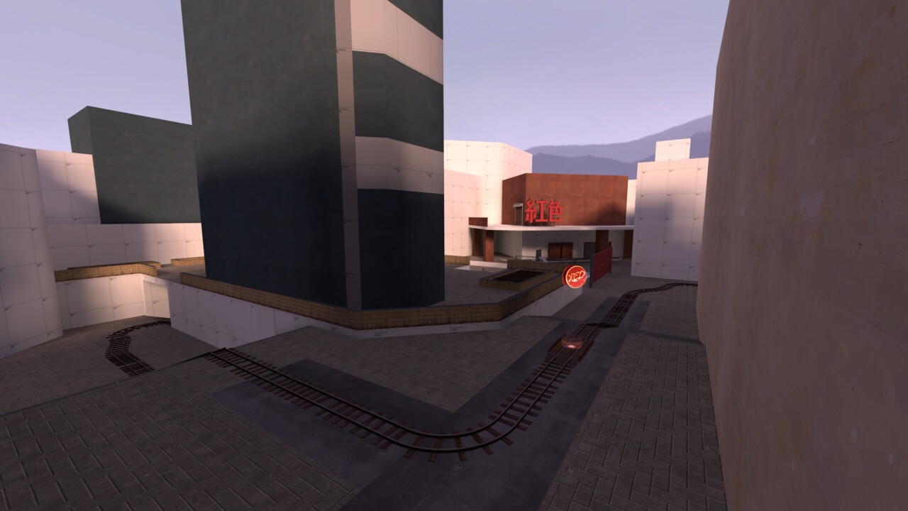
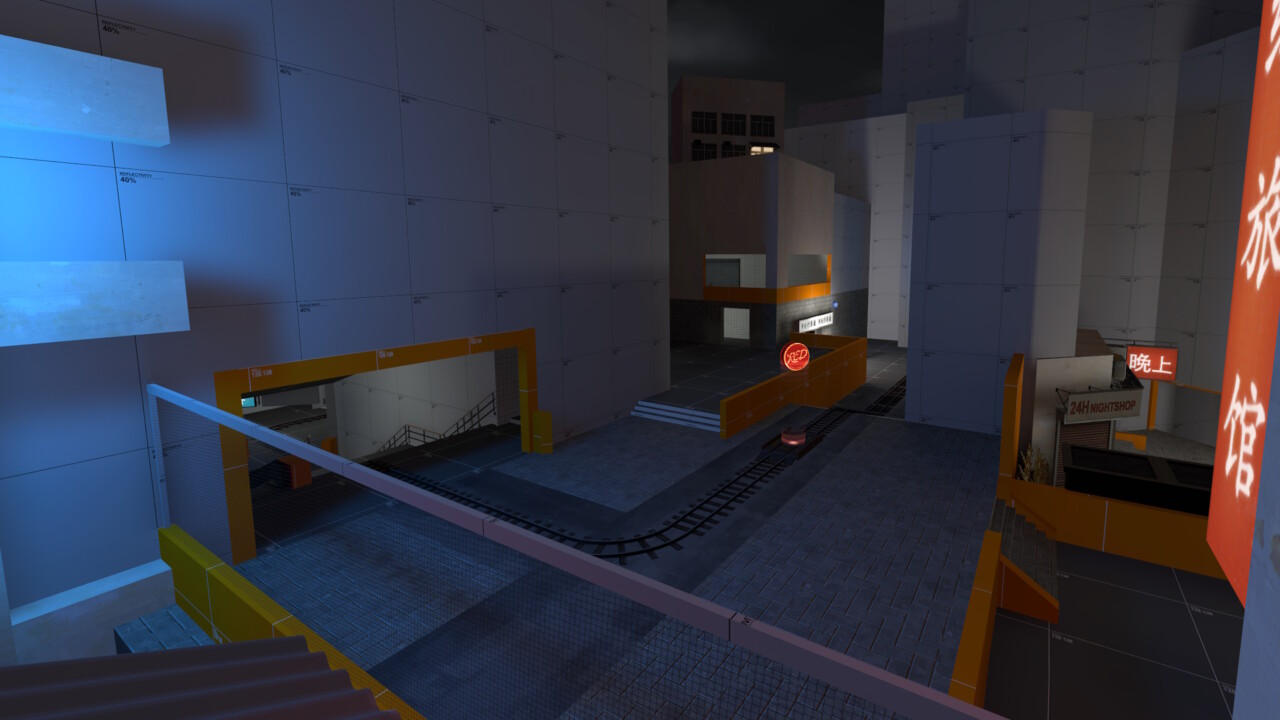
The BLU forward spawn has now been moved to the end of this road (however it still only opens after C has been capped) and the route to D now has a building where the Basketball Court used to be (RIP BBall court 2020-2025). The metro station entrance now appears just after the capping of C offering some cover for defensive sentry nests should RED decide to abandon the defence of C.
Not much really to say about this section. I actually really struggled with the layout due to moving the RED spawn. I want the RED team to be able to access B with haste, but I don’t want BLU to find their way to RED spawn on the way to capping C. A one way drop makes sense, but the rear Red spawn room is underground making this a little awkward. A problem for future Graham I feel.

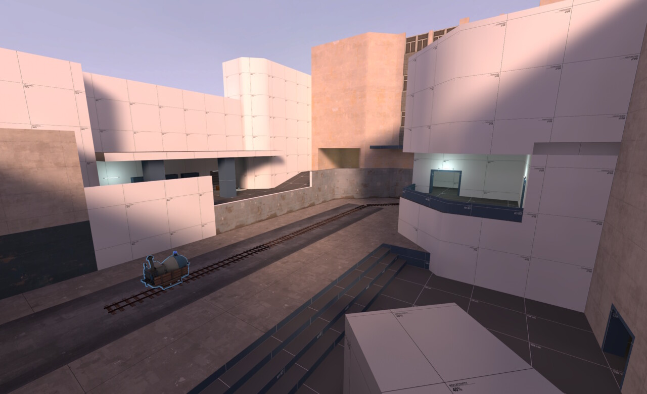
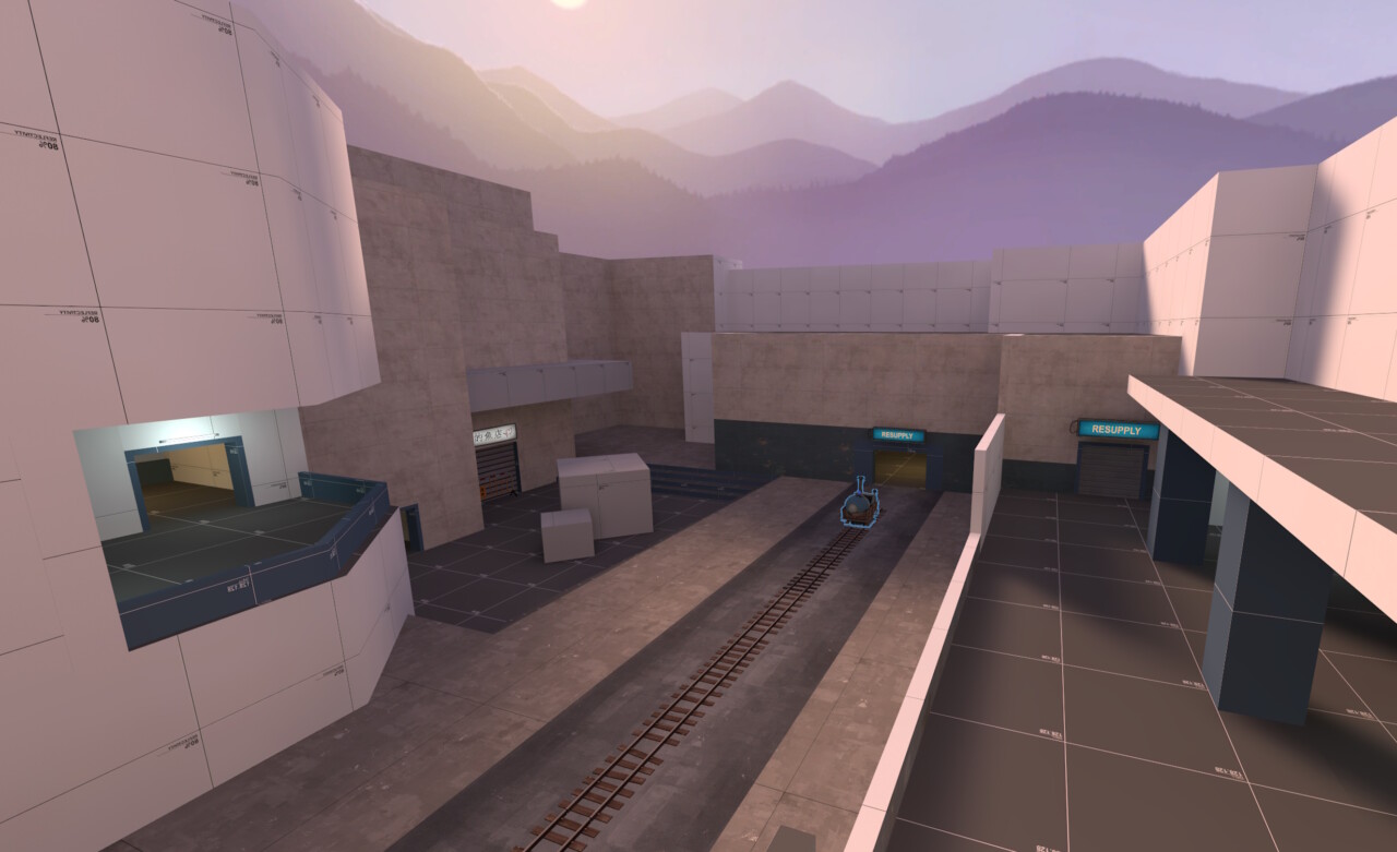
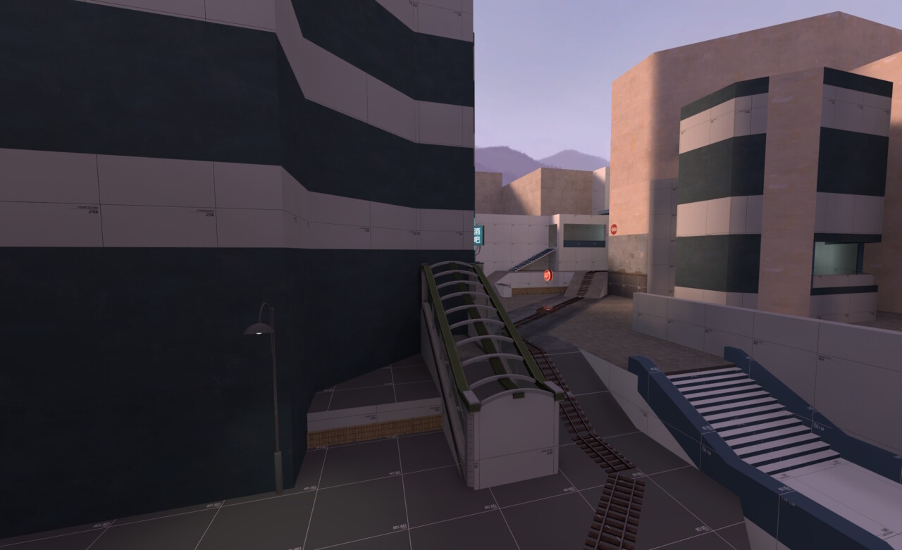
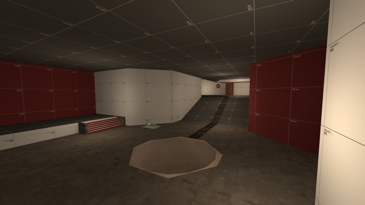
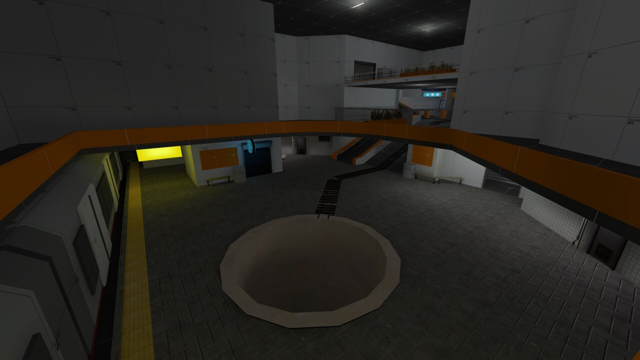
Capture Point D
Capture point D retains its “theme” but was pretty much built from the ground upwards. I knew I wanted the map to end in a metro station; something that has been in the original design since 2020. However the original layout just felt nothing like a metro station (except it being underground I guess). The track also went on just a little too long (It wrapped around almost 270° on itself like playing a game of Snake).
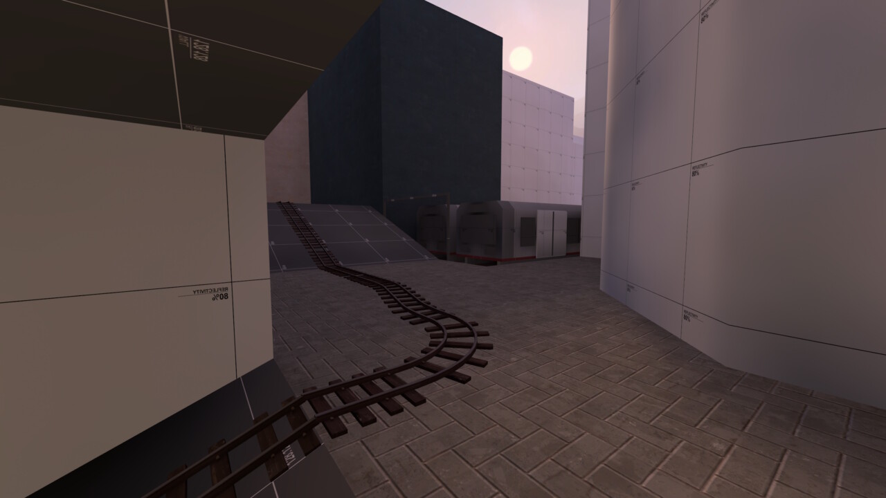
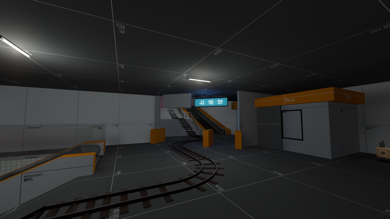
So I cut the track length by a third (having it curve off to the left instead). I rebuilt the ending to make it more believable as a metro station as well as trimmed off a couple of routes BLU could use to attack. I am a little sceptical this area will act as a good final point however. There’s limited space for RED to set up defences and the fact that BLU can just drop in from upper levels really limits the effectiveness of sentry guns. This is definitely one of those “let’s see what the playtests make of it” moments, but I do fully expect to have to rework this area in Alpha 4.
Closing Thoughts
So, how do I feel about the update? Mixed honestly. On one hand I’m super happy I updated it. I am much happier with the map, and the general flow when running around it feels much better. Its more optimised, less confusing and it even has spectator cams now (neat!).
On the other hand, I fear I might have gone too far in some directions. In an attempt to make the map feel more believable, I might have created something not entirely suitable for Team Fortress 2. I was playtesting some maps the other evening and couldn’t help but notice that doors are larger, ceilings taller and spaces typically more open. I won’t know 100% until I’ve had a few playtests however.
Regardless, the core of the map feels much better, so I am hoping any future updates with be small changes as oppose to the huge overhauls that I’ve subjected it to over the last couple of weeks. Until next time!